Authentication Innovation Company-Wide Design System Enterprise Security Platform Healthcare Collaboration 5-Step Design Framework
← Back to Work

Enterprise Security Platform

Role: Lead UX Designer · Timeline: 2023 · Bitdefender, Cluj-Napoca

Redesigning complex enterprise security management for SMBs. A streamlined platform that reduced onboarding from hours to minutes, without sacrificing the power of GravityZone for users who needed it.

The Problem and My Part in Solving It

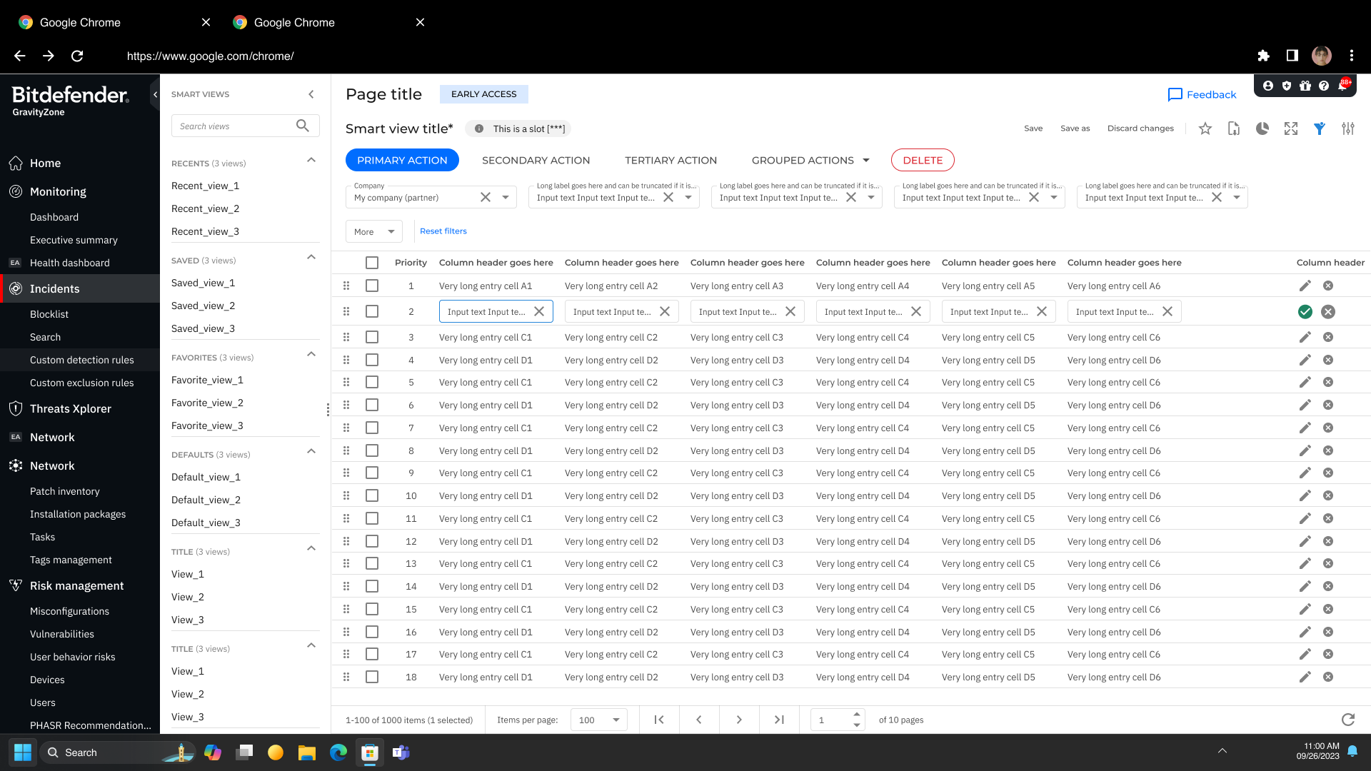
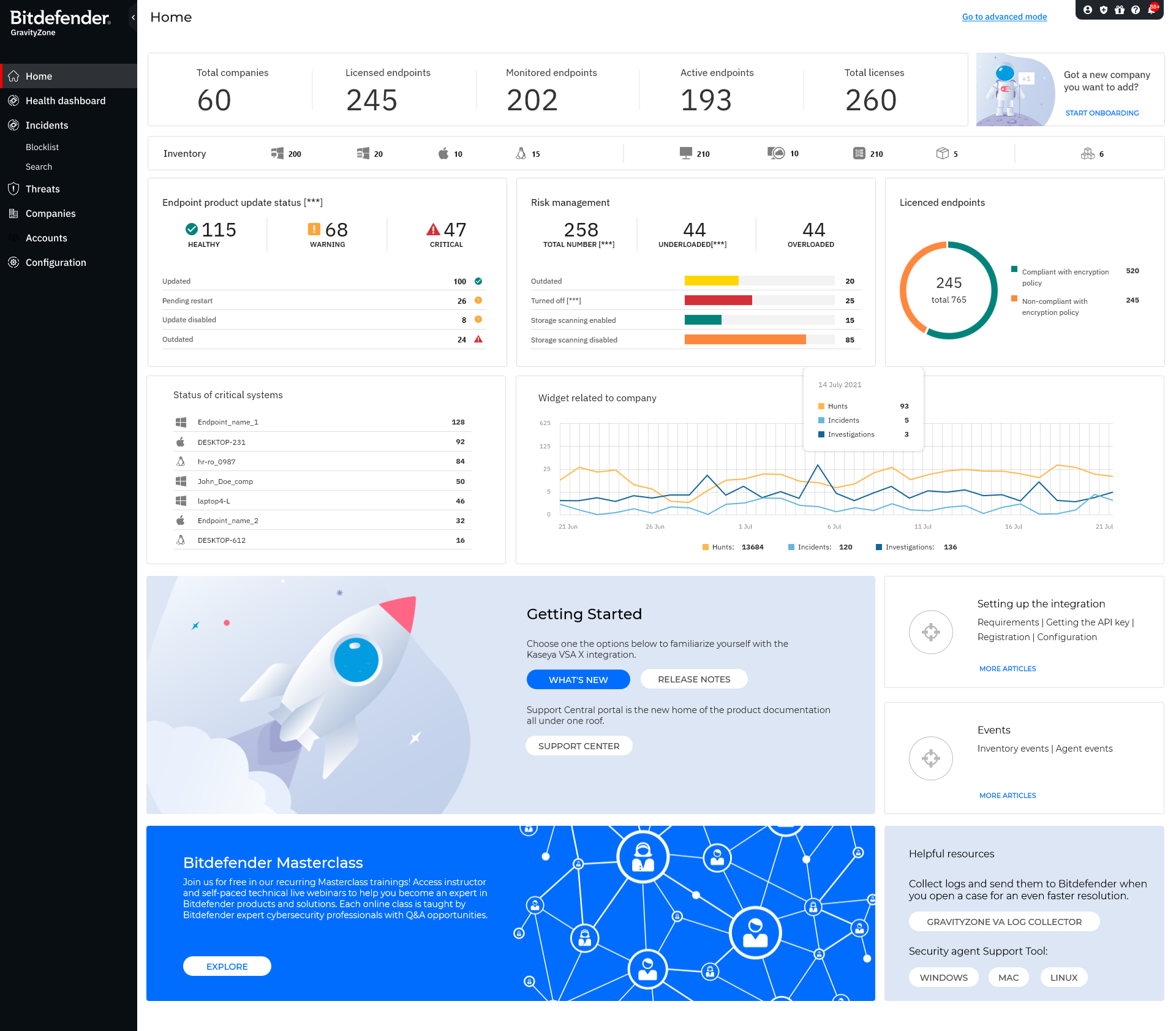
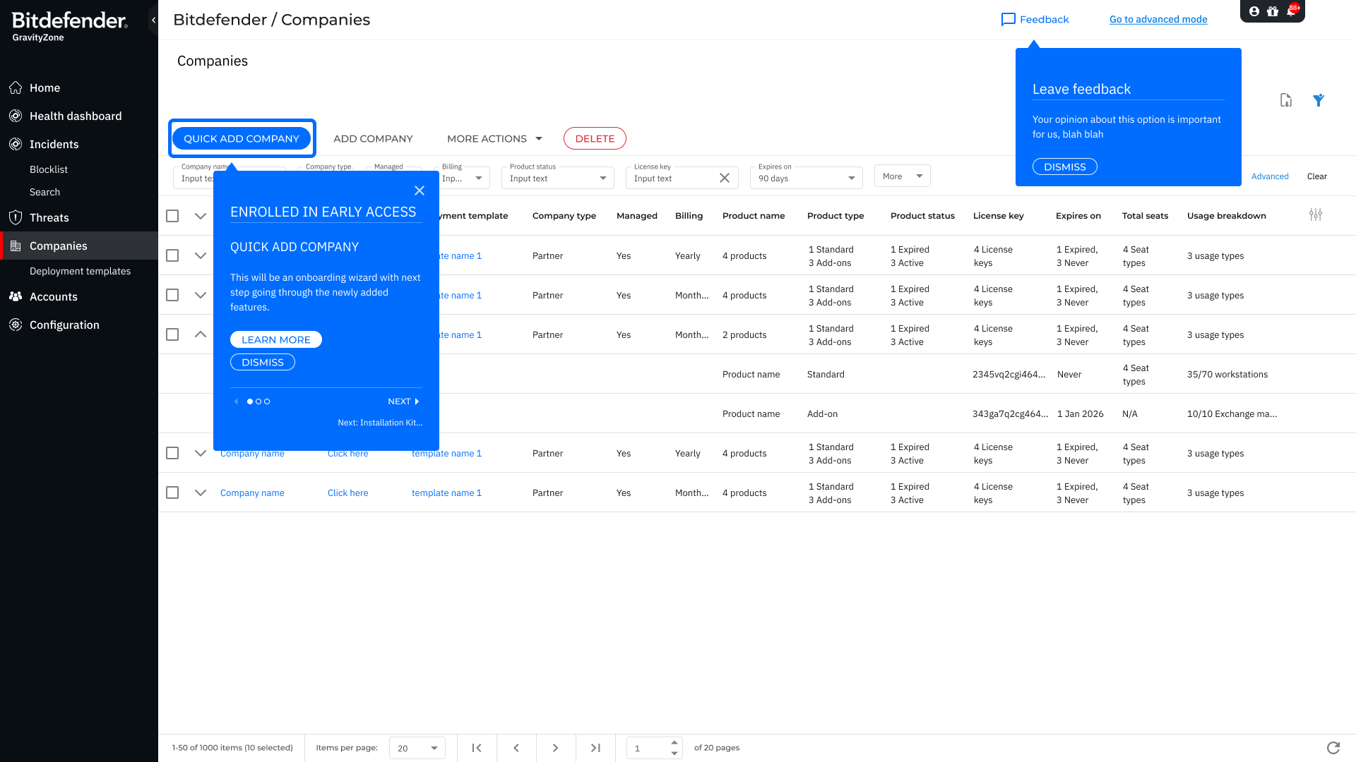
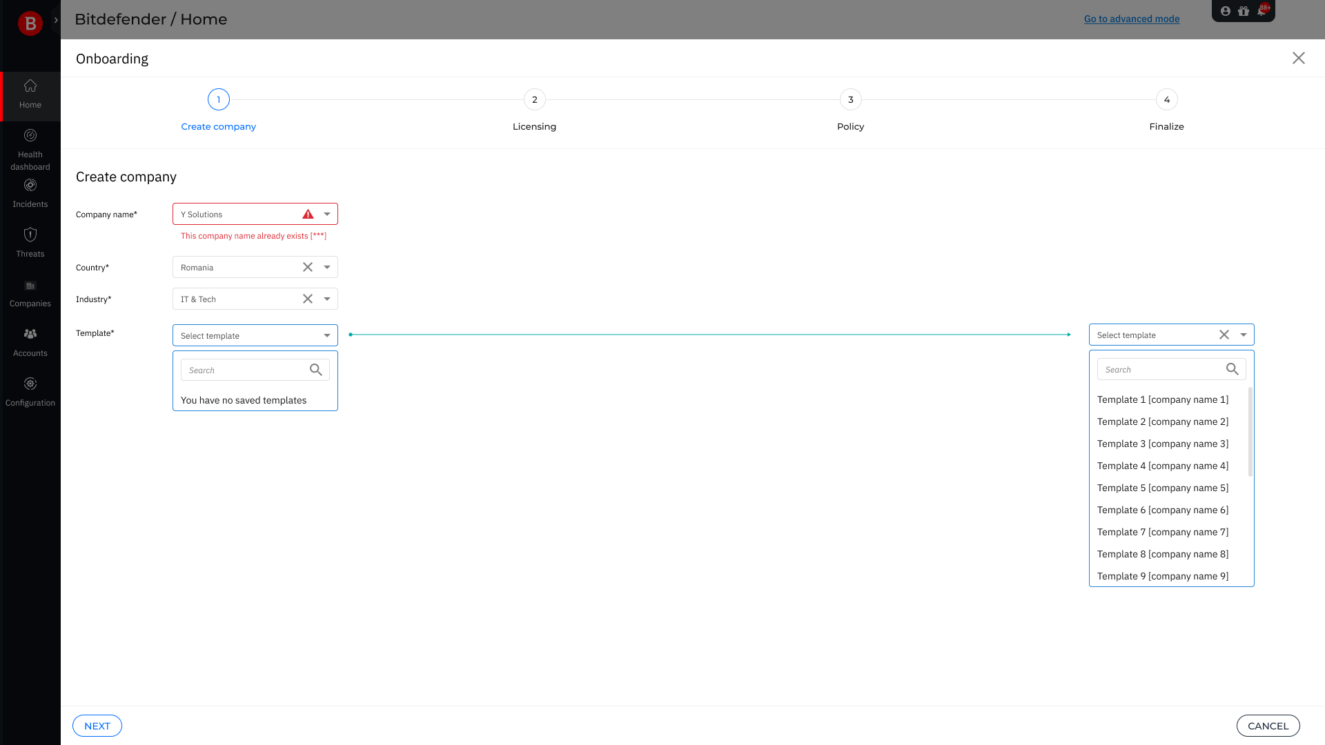
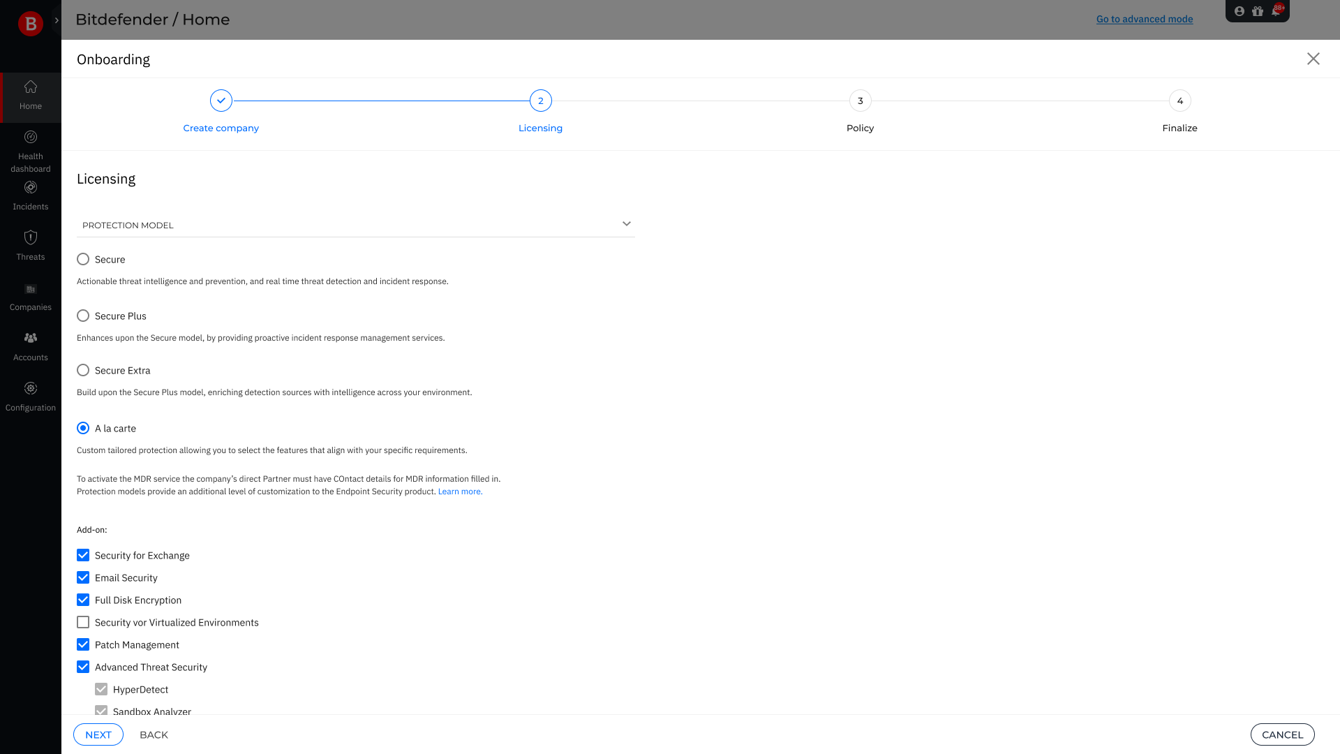
GravityZone was powerful, but overwhelming. SMBs represented 70% of the user base, yet the platform was built for enterprise complexity. Onboarding a single company took hours. The interface assumed expertise that most SMB admins simply didn't have.

I led the UX design effort as part of a small, focused team: an Engineering Director, a Product Manager, and myself. We spent 12+ hours across debates and working sessions aligning on what the MVP should and shouldn't include. My responsibilities spanned the full project:

  • UX strategy and user research across SMB and enterprise segments
  • User flows, wireframes, and final designs for the simplified experience
  • Weekly facilitation between Engineering and Product to keep decisions moving
  • Close collaboration with Engineering to maximize existing code and design assets
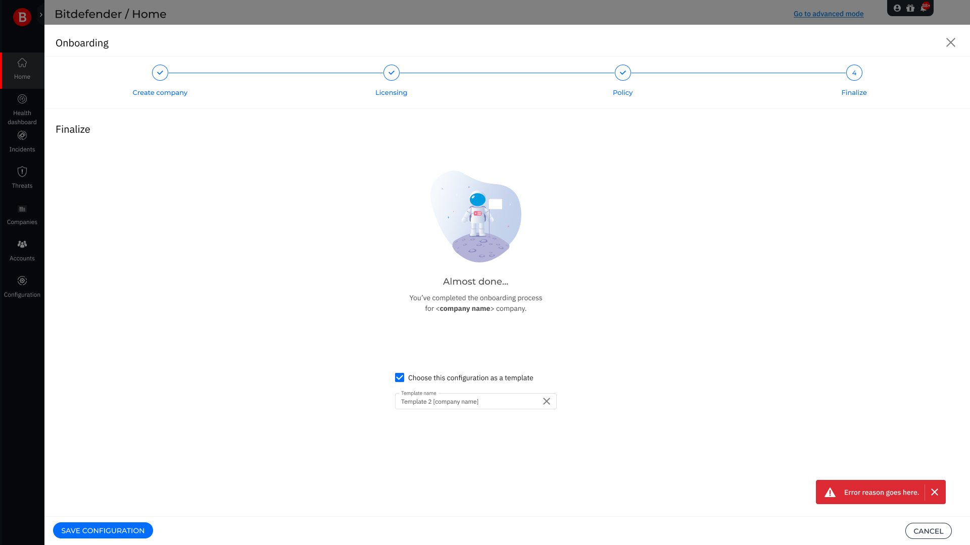
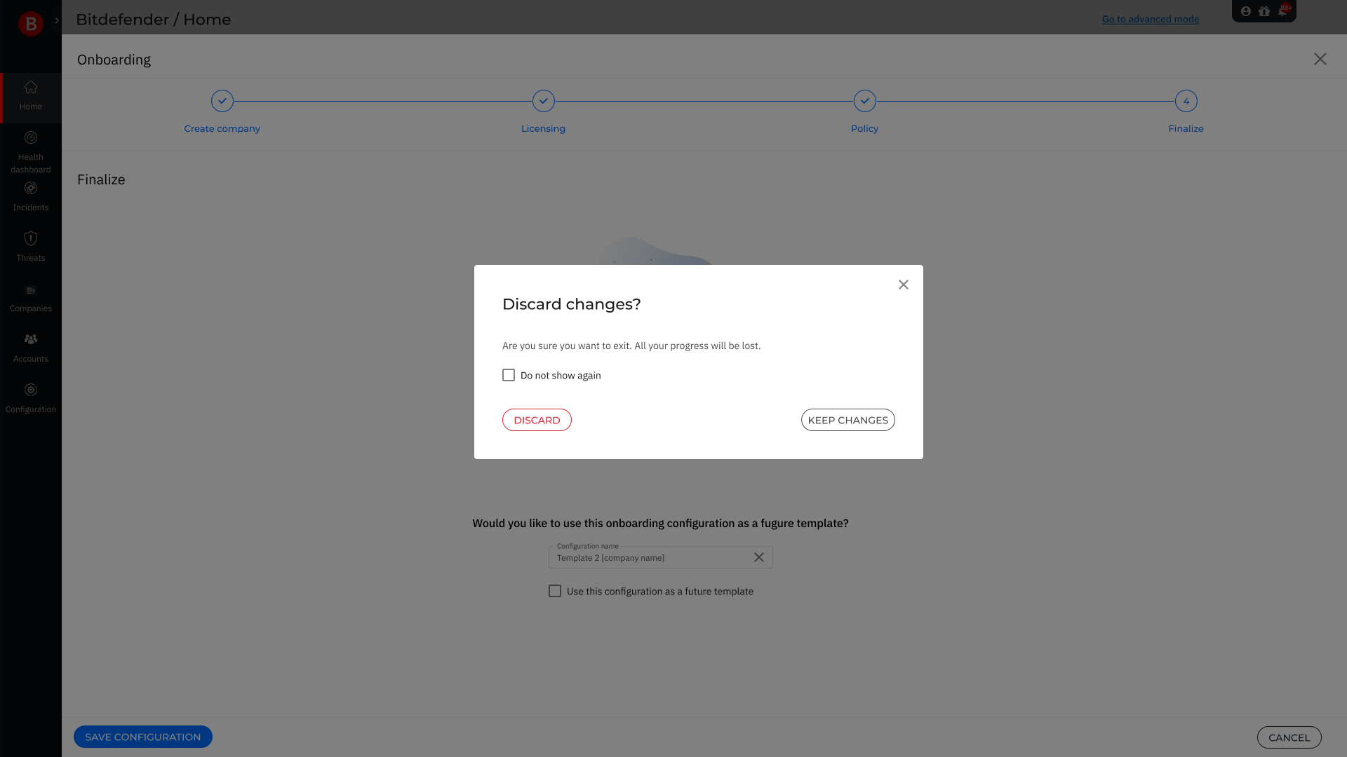
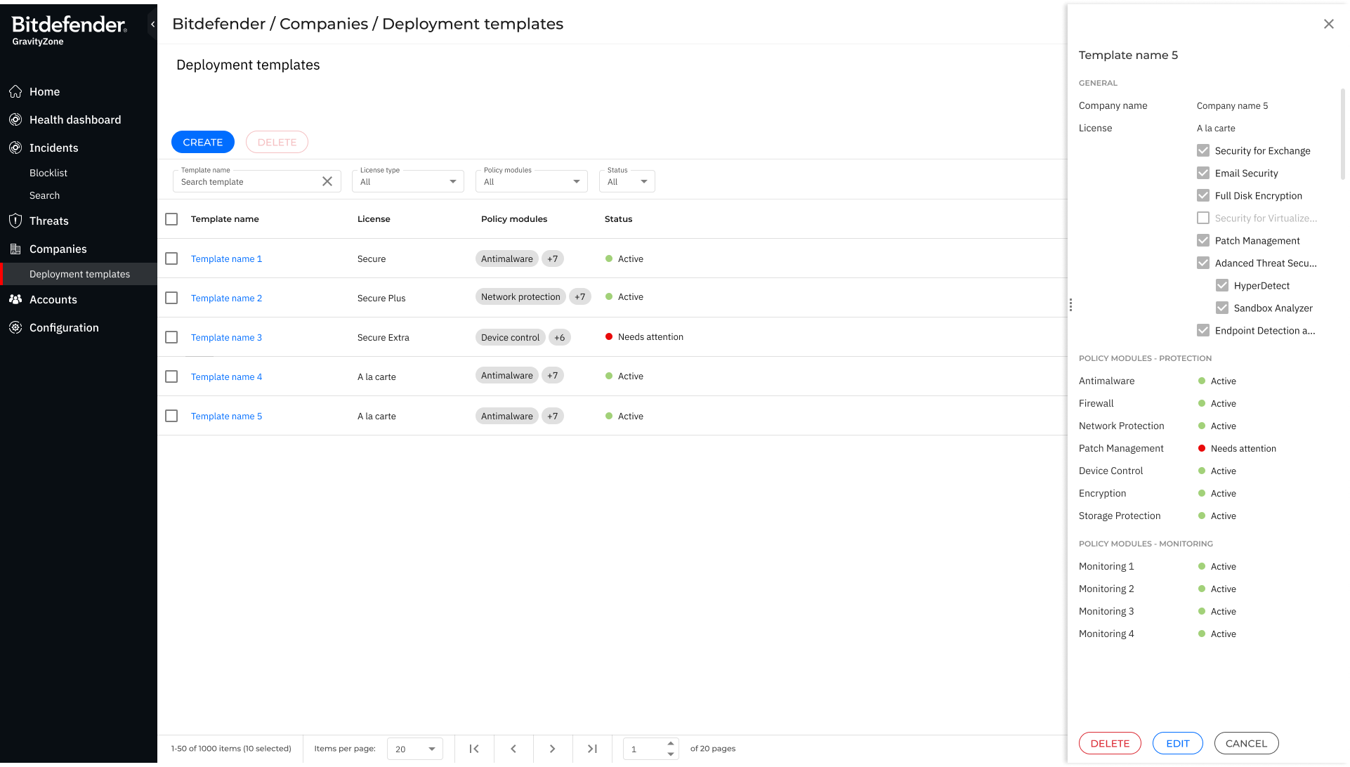
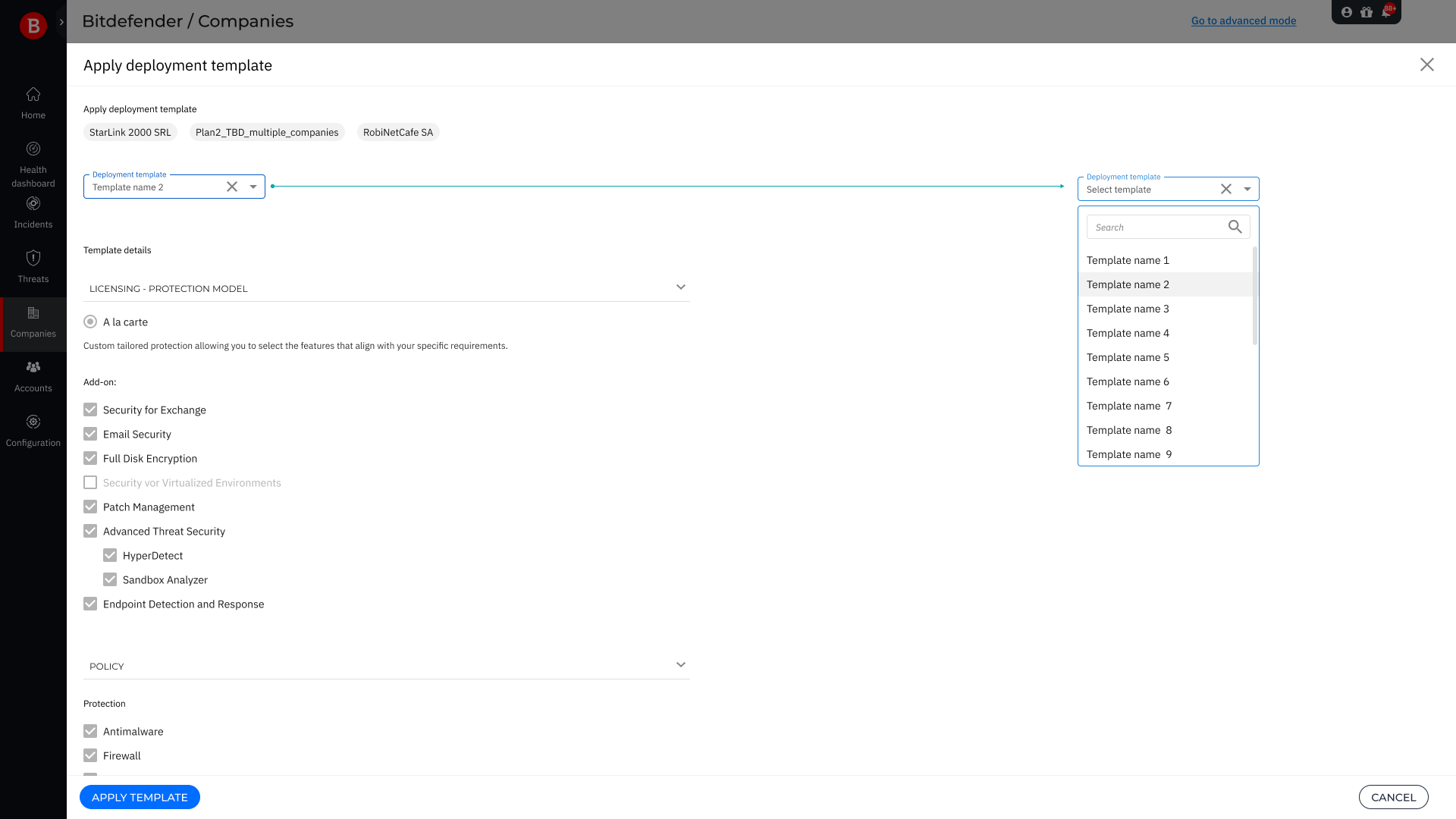
  • Design of the template system enabling 2-3 click repeat onboarding

What We Were Starting From

The full GravityZone console was feature-complete and trusted by enterprise teams. For an SMB admin managing a handful of companies, it was a different story: deep navigation hierarchies, configuration options without context, and an onboarding process that required expert knowledge just to get started.

This is what users saw when they landed in GravityZone. Powerful, but a lot to take in on day one.

Full GravityZone console home view

A Dual-Mode Platform

The key decision was not to build a separate product but to create a different entry point into the same platform. Simplified mode surfaced only what SMB admins needed day-to-day. For tech-savvy users and admins who needed more, a single toggle switched them into the full Advanced mode.

This gave users confidence that nothing was removed, just reorganized. Below is the simplified home view: a focused dashboard showing exactly what matters, with a clear onboarding prompt for new companies.

GravityZone Simplified home dashboard

From First Click to Repeat Onboarding

The original onboarding required navigating multiple screens, setting dozens of configuration options, and understanding Bitdefender licensing before a single company was live. The redesign collapsed this into a 4-step wizard: Create company, Licensing, Policy, Finalize.

The template system took it further. Every completed configuration can be saved as a template, turning the next onboarding into 2-3 clicks. Below is the full journey, from the first "Quick Add Company" through the wizard steps, edge cases, and the template management experience.

Impact & Outcomes

70%

Of the user base directly served by the simplified experience

2-3

Clicks to onboard a repeat company using saved templates

Hours → Minutes

Onboarding time reduction for new companies

The platform launched as a dual-mode experience, serving SMB and enterprise users from the same codebase. By working closely with Engineering from day one, we maximized existing components and avoided rebuilding what was already solid, keeping the development timeline lean.

What I Learned

Simplification is not subtraction

The instinct when simplifying is to remove things. The harder and more correct move is to reorganize them. Everything that existed in GravityZone still existed in Simplified mode, just surfaced differently. The mode toggle wasn't a compromise, it was the design.

Progressive disclosure and smart defaults did most of the heavy lifting. The platform felt simple because it made good assumptions upfront, not because it offered less.

What I'd do differently: I'd involve SMB users earlier in the process, before the wireframe stage. We made good decisions in the debates, but some of those 12+ hours could have been shorter with more direct user input to anchor the discussion. Assumptions held up, but they were still assumptions.