Authentication Innovation Company-Wide Design System Enterprise Security Platform Healthcare Collaboration 5-Step Design Framework
← Back to Work

Healthcare Collaboration

Role: UX Designer · Client: Ascom · Context: Hospital Mobile Platform

Designing two focused mobile applications for hospital nurses using the Ascom MYCO 2 device, reducing cognitive load in one of the most demanding work environments imaginable.

The Brief and My Part in It

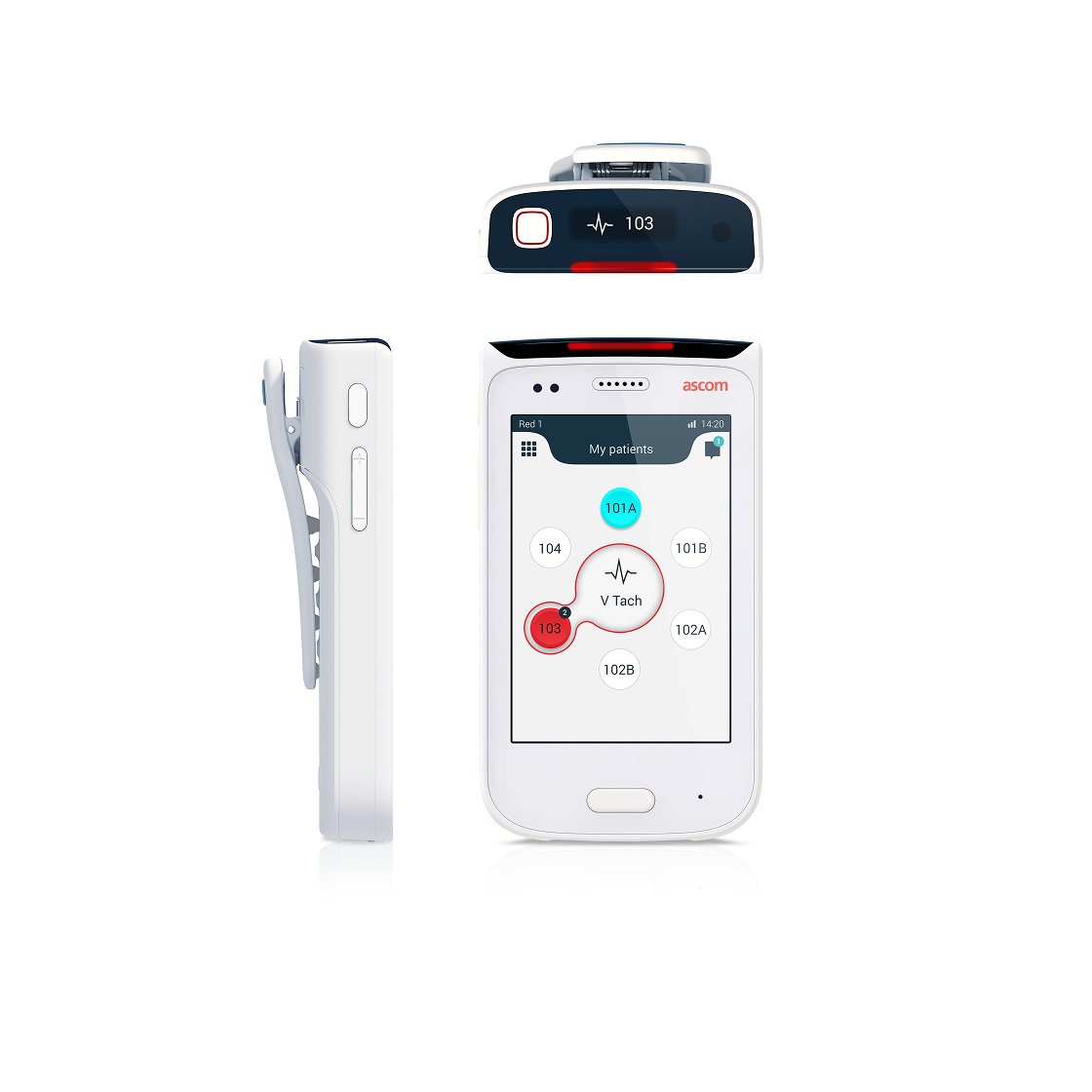
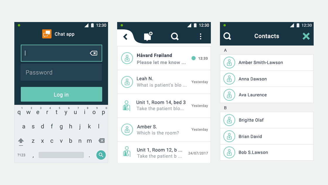
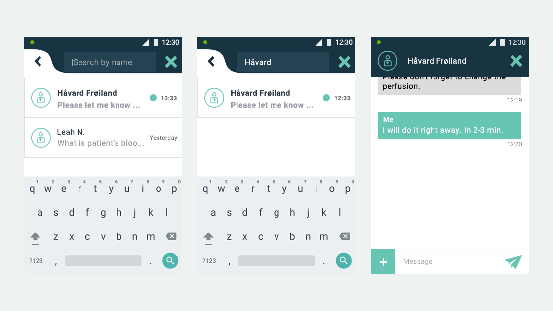
Ascom, a Swiss enterprise communications company, had developed the MYCO 2: an enterprise-grade smartphone built specifically for hospital nurses. The hardware was solid. The problem was the environment it had to work in.

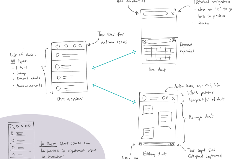
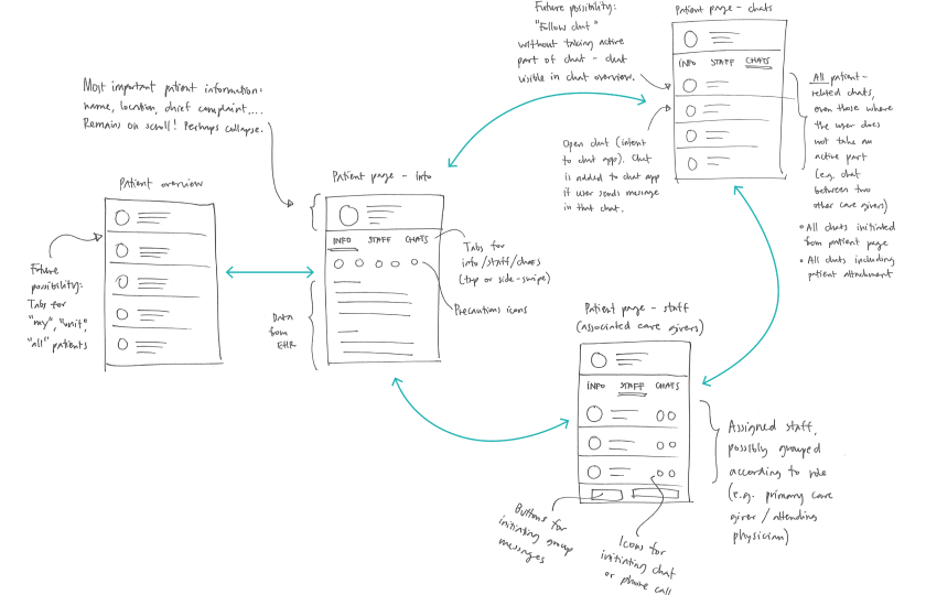
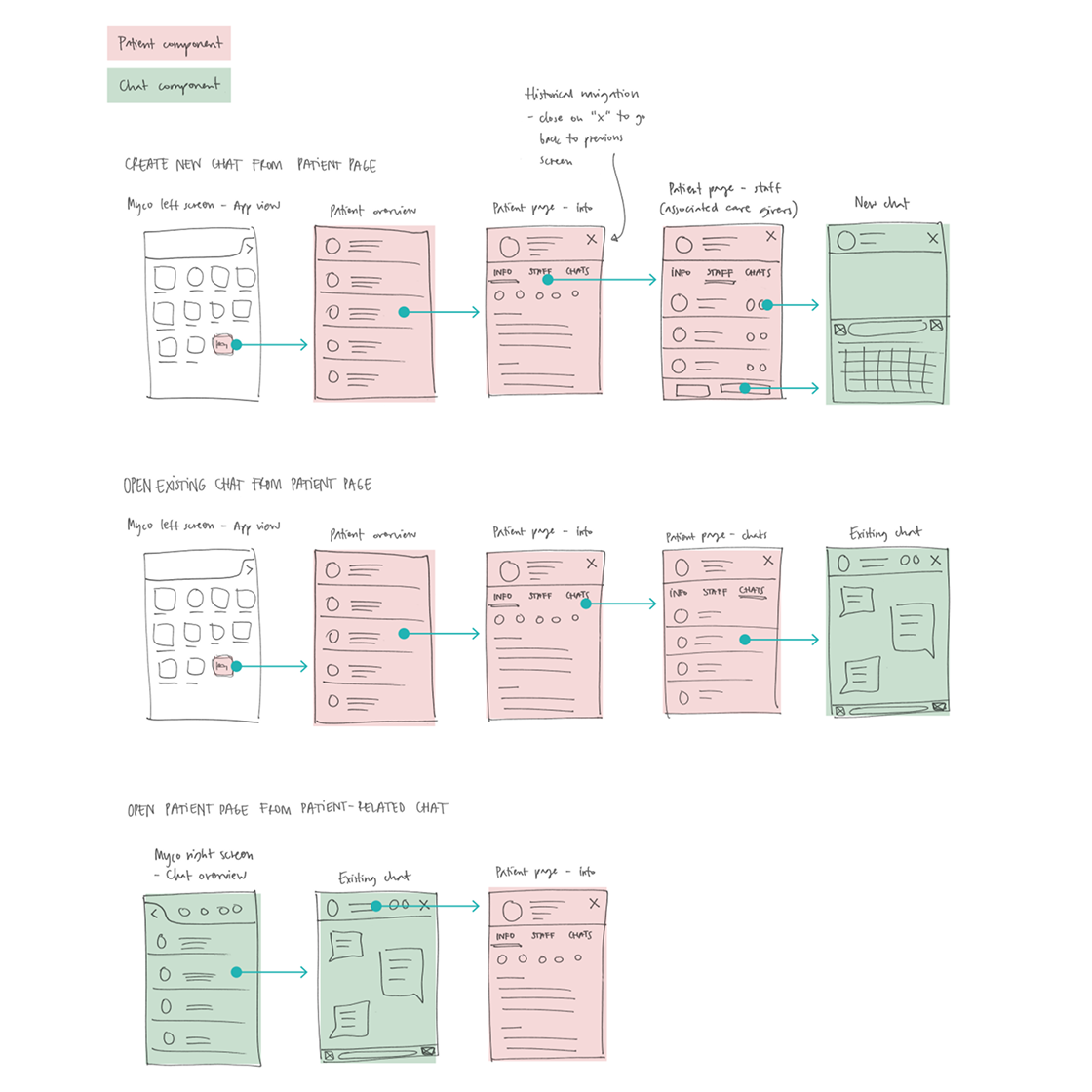
I joined as UX designer alongside a colleague, responsible for on-site research, concept design, user flows, wireframes, and guerrilla testing. We had a tight timeline and no room for assumptions.

  • On-site user research and nurse shadowing
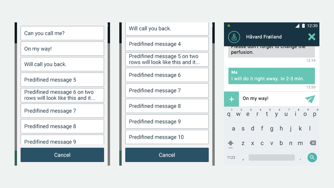
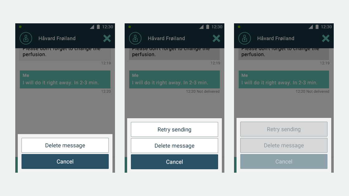
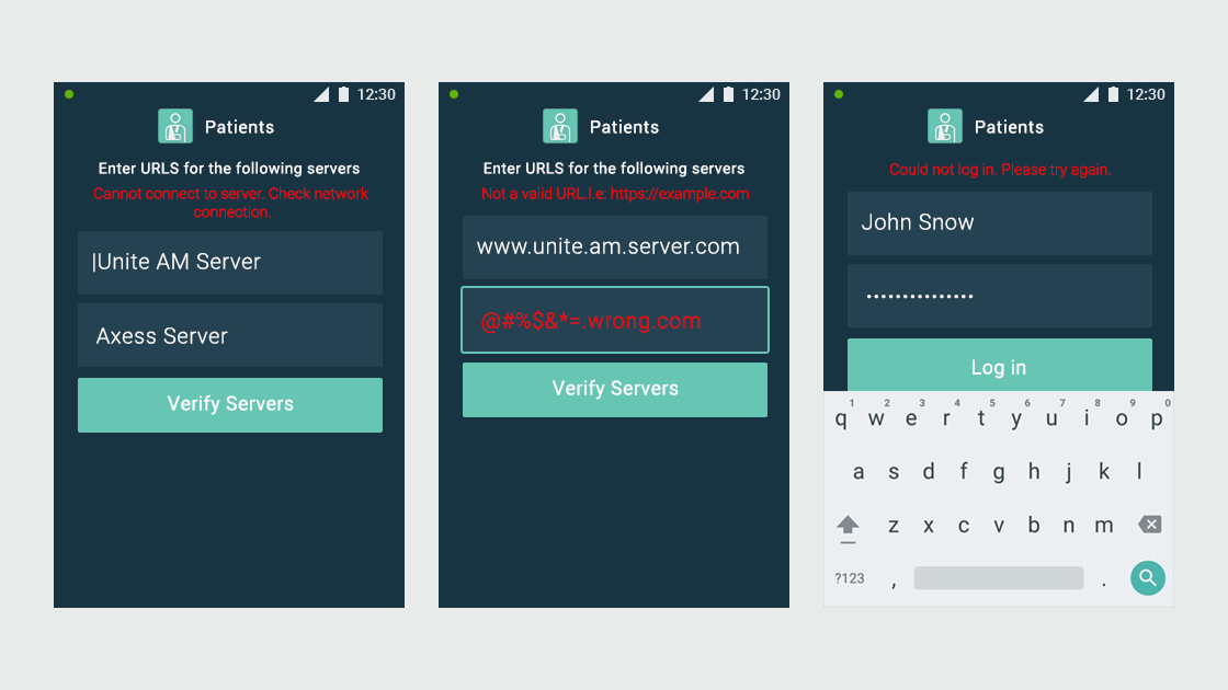
  • Concept definition and design direction
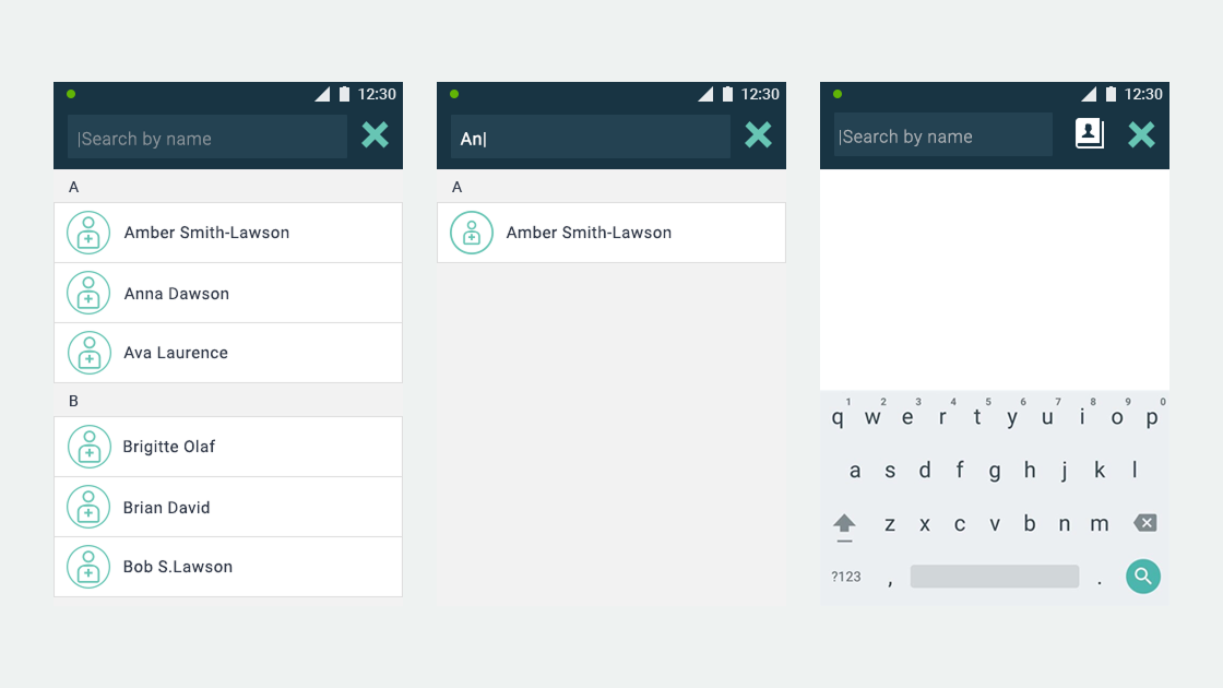
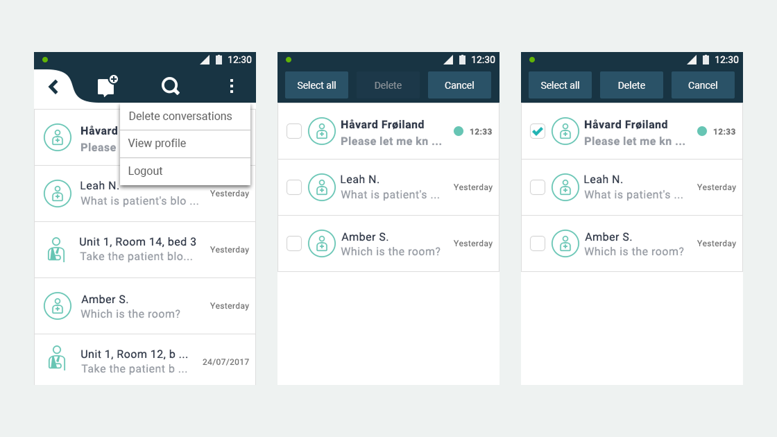
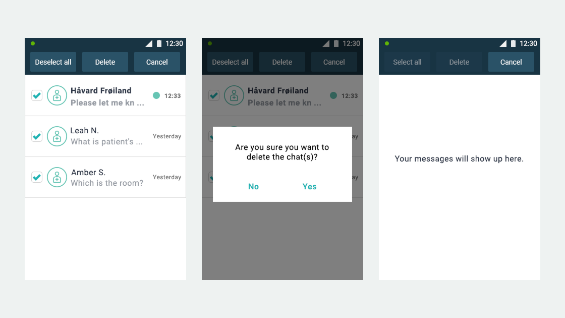
  • User flows and wireframes for both applications
  • Guerrilla usability testing with hospital staff

Four Screens, One Nurse, Zero Margin for Error

Throughout a shift, nurses were monitoring 3-4 different screens simultaneously. One showed which patients needed attention. Another held medication schedules. A third handled staff communication. A fourth managed alarm notifications from multiple sources across the ward.

The result was complete cognitive overload. And we couldn't fix the other screens. We had no control over the hospital's existing systems. We had to design something that worked alongside them, not against them.

We spent a full day shadowing a nurse through his complete shift. We watched every touchpoint, every interruption, every moment where the system friction translated into a real cost on his attention. That evening we threw out our original concept and started over.

One Day, One Nurse, One Shift

We went into the project expecting to design a single unified app. Competitors were doing the same: enterprise messaging tools, patient-alert platforms, coordination apps. Most followed the same logic: put everything in one place. None of them were solving the real problem, because the problem wasn't the number of apps. It was the cost of switching mental modes mid-task.

We spent a full day at the hospital shadowing one nurse through his shift. Not an interview, not a workshop: an entire day, room to room, from handover to handover. We watched an alarm fire on one device while he was mid-conversation on another. We saw him physically glance between screens trying to prioritize, abandon one task to handle another, then try to remember where he was. By the end of the shift we knew we needed to start over.

The insight was simple once we saw it: communication and patient care are two fundamentally different mental modes. Mixing them forces constant context-switching, which is exactly what the environment was already punishing nurses for.

MYCO 2 device
Nurse using MYCO device in hospital

Two Apps, Not One

When nurses were checking on a patient, they didn't want to be interrupted by a chat notification. When they were in a conversation, they didn't want patient data competing for attention. The cognitive cost of context-switching was the problem. A single app would have reproduced exactly what we were trying to solve.

Chat UI sketches
App 1

Chat App

Dedicated strictly to communication between nurses and staff. 1-to-1 messages, group chats, patient-linked conversations, and announcements. Clean and distraction-free, with every chat type accessible from a single overview.

Patients UI sketches
App 2

Patient App

Focused entirely on patient information: medical status, staff assignments, alarms, and care coordination. Three-tab structure per patient: Info, Staff, and Chats. Nothing that doesn't belong to patient care lives here.

The two apps connect. A patient-linked chat initiated from the Patient App surfaces in the Chat App. A nurse can jump from a conversation directly to the relevant patient's record. Separation of concerns does not mean isolation.

Mapping the Connections

The flows document how the two apps connect in practice: creating a new chat from the patient page, opening an existing chat, and navigating back from a patient-related conversation to the patient record.

Patient and Chat user flows

Focused Communication

The Chat App handles all communication between clinical staff. From the overview screen, nurses can see every conversation type at a glance. New chats, group conversations, and patient-linked messages each have a distinct visual identity to reduce scanning effort under time pressure.

Patient-Centered Care

The Patient App gives nurses a complete view of each patient through three tabs: Info, Staff, and Chats. Patient information stays visible at the top on scroll. The Staff tab shows assigned caregivers with availability status and quick actions. The Chats tab surfaces only conversations linked to that patient.

Testing in the Wild

5

Nurses tested the concept in guerrilla sessions

1 Day

Full shift shadowing before redesign

2 Apps

Instead of one, by deliberate design decision

The day after our redesign sprint, we ran guerrilla testing with five nurses using cafeteria vouchers as incentives. The feedback was clear: nurses appreciated being able to focus on one context at a time. Checking patient information without chat notifications competing for attention was exactly what they needed. The separation felt natural, not fragmenting.

What This Project Taught Me

Design for the ecosystem, not just the product

We had no control over the other systems nurses were using. We couldn't change the medication screen, the alarm panel, or the patient records system. Our only option was to understand how our product would live alongside them, and design accordingly.

One full day of shadowing revealed more than any brief or requirements document could have. Seeing cognitive load in real-time, watching the interruptions stack up, understanding the cost of each context-switch: that's the research that shaped every decision we made.

What I'd do differently: I'd push for more time in the hospital before the design phase, not just one day. The shadowing session was transformative but compressed. A second day with a different nurse on a different unit would have stress-tested our assumptions considerably earlier.